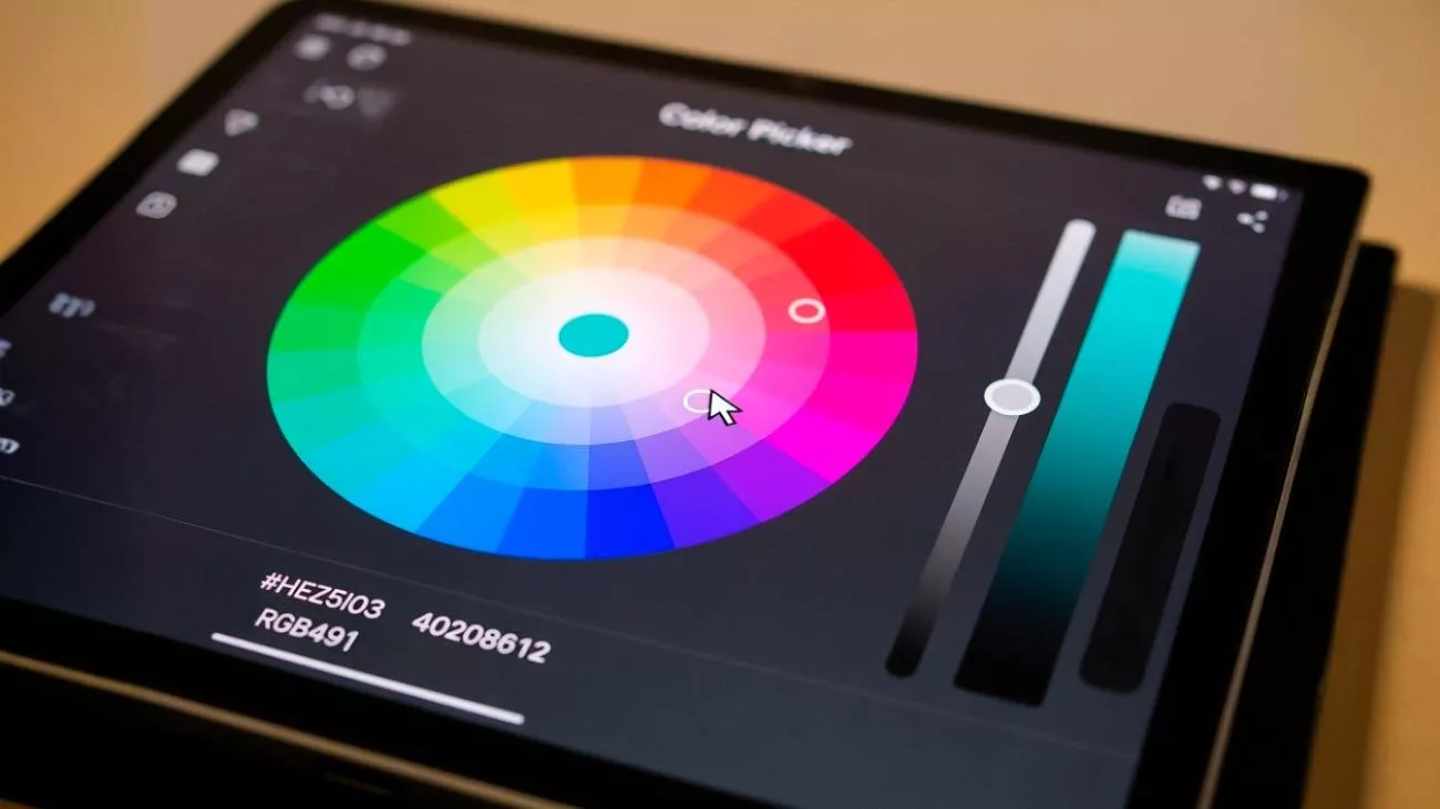
Color in digital products has one job: help users know where they are and what to do next.
→ Not to look pretty (though that helps).
→ Not to match your logo (though it should).
→ But to create clarity.
Without a proper color system, every new feature you add makes your product harder to navigate. You end up with buttons competing for attention, sections bleeding into each other, and users who can't tell what's clickable and what's not.
At Rocksoft, our color system didn't just happen overnight - it grew up with us.
We have always relied on a lead color, supported by a modest secondary palette. Over time, we iterated on that main shade multiple times, to make it represent our stability, focus and reliability. Brand cannot stand still while the company moves forward. As our strategy became more refined and our service offerings grew into a comprehensive ecosystem our visual identity had to catch up.
We built our new palette to act as a navigation system. It is designed to provide clarity, designate context and ensure that as clients move through our ecosystem, they know exactly where they stand.
Structure: The 60-30-10 rule
We turned to a timeless design principle: the 60-30-10 rule. This industry standard ensures our interfaces remain clean, balanced, and readable, preventing our diverse color palette from becoming "noise"

Here is how we apply this classic ratio to the Rocksoft ecosystem:
- 60% — Canvas (Neutral): We dedicate the majority of the screen to Peak White or Granite Black. This minimises cognitive load and provides a stable, comfortable viewing experience.
- 30% — Secondary: We use a secondary neutral to create hierarchy and contrast. This distinguishes sections and navigation without shouting for attention.
- 10% — Accent: This is where the strategy lives. By limiting our specific service colors (like Blue, Purple, or Mint) to just 10%, we transform them into a "visual code"
Color scale
Every hue in our system—from our neutrals to our semantic accents—is expanded into a full 9-point scale ranging from 100 to 900.
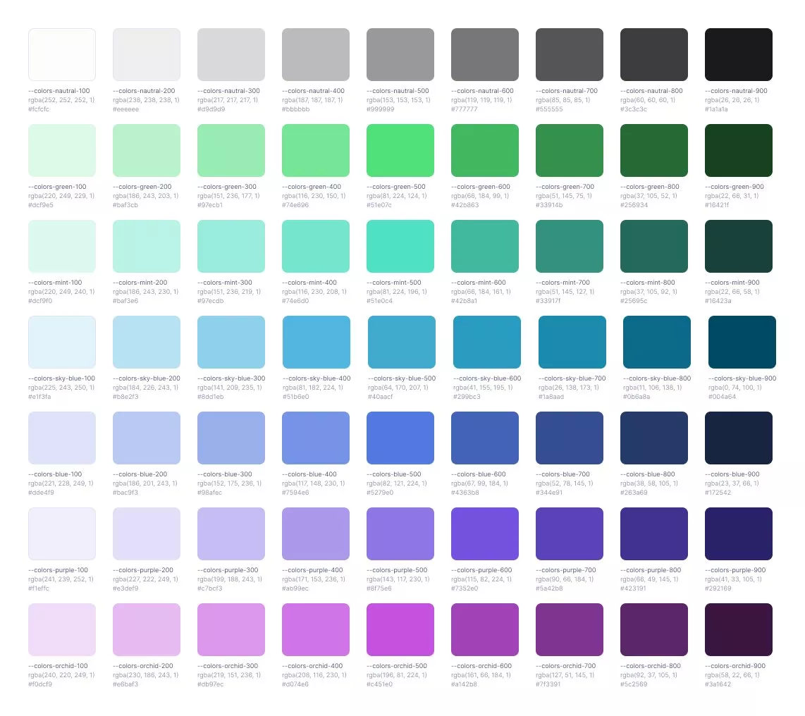
- 100–300 (Light): Used for subtle backgrounds, surfaces, and low-emphasis borders.
- 400–600 (Main): Main shades used for primary buttons, icons, and brand identifiers.
- 700–900 (Dark): Used for high-contrast text, active states, and strong structural boundaries.
This systematic scaling allows us to build complex interfaces with hover states, depth, and clear hierarchy without ever leaving the mathematical consistency of the Rocksoft family.
Our core colors : Stability and contrast
To support our "visual code," we rely on a primary palette designed for stability. These three core colors form the consistent foundation of our brand's visual identity:
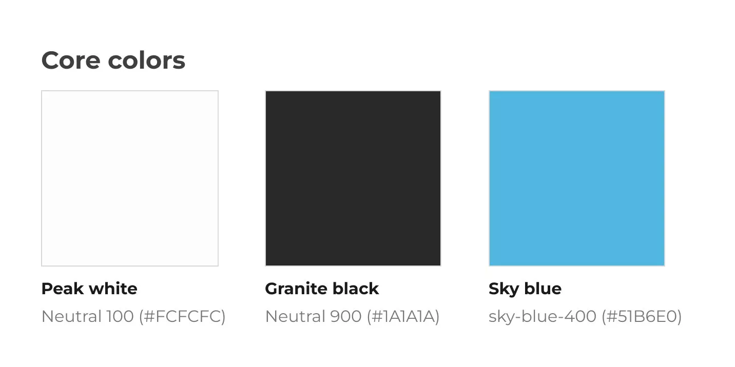
- Peak white (Neutral 100): Our primary canvas. It ensures maximum readability and creates a feeling of openness and clarity.
- Granite black (Neutral 900): The anchor. Used for high-contrast text and structural elements, it grounds the design and reduces eye strain in dark mode.
- Sky blue (Primary accent): While our service colors change, "Sky blue" remains our base. It represents the "Rocksoft" brand core—reliable and tech-savvy.
Psychology behind our service colors
We assigned specific psychological roles to each hue. This transforms color into a "visual code":

- Software development – Blue
- Blue remains our technical core. It is the most technologically neutral color, making it the perfect standard for production environments and mobile apps.It signals to the user that they are in the "Build" phase—dealing with code, stability, and core infrastructure.
- Product design – Purple
- Purple sits at the intersection of technology and art. We use it to signal creativity, iteration, and "product" thinking. It distinguishes the design and auditing phase from hard engineering, feeling expandable and creative.

- Automation & integrations – Orchid
- Orchid is our bridge to the future. As AI adoption grows, this color has become synonymous with machine learning and data pipelines. It signals modern, cutting-edge workflows that automate the manual past.

- Strategy & consulting – Green
- Green represents "correctness," data flow, and the "green light" for growth. It fits perfectly with business analysis and technology stack consulting, where the goal is to streamline processes and find efficiency.

- Maintenance & support – Mint
- Support requires a steady hand. Mint is a calm, stable color associated with care, peace of mind, and safety. It visually separates the high-energy "Build" phase from the steady "Retain" phase, signaling that the system is being monitored and protected.
At Rocksoft, design isn't just about aesthetics, it's also about function.
By applying the 60-30-10 rule and our semantic color codes, we ensure that our interface organises complexity rather than adding to it. This visual system mirrors our business strategy: clear, reliable, and structured.